Wednesday, November 30, 2011
WOMENS IMPACT ON DESIGN
Labels:
Deborah,
Female,
Graphic Design,
Illustration,
Olympics,
Sexist,
Sussman
Saturday, October 22, 2011
ANIMATION: KIRSTEN LEPORE
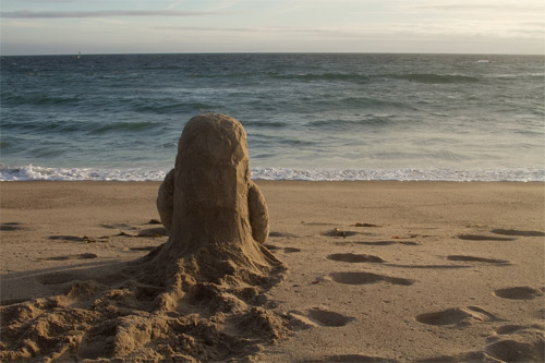
Bottle is the stopmotion story of two friends who pass messages across the world through the use of a glass bottle. The animation starts with the movement of a mass of sand, scuttling around the beach appearing to look for something; then the bottle itself is discovered. Throughout the animation the two characters trade items using the bottle as the medium; the result of this; two fully personified mounds of sand and snow. The story is deep and much more than meets-the-eye, this 6 minute short is both thought-provoking and inspiring.
Watch Bottle on Youtube or Vimeo
Labels:
Animation,
Kirsten. Lepore,
Stop Frame
Thursday, October 20, 2011
VISUAL TIMELINE OF ANIMATION
1831 Phenakitoscope
1834 Zoeotrope
1868 Kinetograph; flipbook
1872 Eadward Muybridge begins research into animals in motion
1889 Kinetoscope
1886 Vitascope
1887 Praxtinoscope, Charles-Émile Reynaud
1892 Reynaud begins showing his animations in his theatre combining his earlier Praxtinoscope and a projector

1906 Humorous Phases of Funny Faces by J. Stuart Blackton
1908 Emile Cohl makes Phantasmagorie, first film depicting white figures on a black background
1910 'En Route' is made, it is the first cut out animation
1914 'Gertie, the Trained Dinosaur'. 10,000 hand-drawn frames
1917 'El Apostol' the first full length animation. 58,000 frames and 70 minutes
1919 'Felix the Cat' by Pat Sullivan
1923 Disney is founded by brothers Walt and Roy
1928 Steamboat Willie, first film using synced sound
1961 John Whitney uses computers to generate graphics for title sequences. He starts to develop his hardware and create algorithms for more complex digital images
1979 'Graphics Group' is created, later renamed Pixar
1982 TRON uses CGI combined with film footage
1983 CGI is used in scenes from Star Wars, the Wrath of Kahn
1986 Pixars first animation, 'Luxo Jr' is released
1993 Jurassic Park uses CGI for realistic living creatures
1995 Toy Story is the first feature length, completely CGI movie
Friday, October 14, 2011
RESEARCH: ORIGINS OF ANIMATION
Traditional animation dates back to 180AD, with the first zoetrope invented by the Chinese Ting Huan. Devices such as the Thaumatrope and the Phenakistoscope were early techniques to create simple moving image animations.
The first hand-drawn animation is said to be Humourous Stages of Funny Faces (1906) by J. Stuart Blackton. The first use of stop-motion animation is credited to Albert E. Smith and J. Stuart Blackton together, their short video titled The Humpty Dumpty Circus shows figures doing various acrobatics. Although I would consider the Humourous Stages of Funny Faces a stop-frame animation in itself.
Thursday, October 06, 2011
Wednesday, October 05, 2011
Monday, October 03, 2011
Thursday, September 29, 2011
YSP VISIT
Jaume Plensa
> Hear No Evil, See No Evil, Speak No Evil
> In the Midst of Dreams
> Yorkshire Soul I - III
> Alabaster Heads
> 29 Psalms
> Jerusalem
> The Heart of Trees
Barbara Hepworth
> Two Squares with Circles
> The Family of Man
Sophie Ryder
> Crawling Lady Hare
> Sitting
Greyworld
> Playground
Anthony Caro
> Promenade
David Nash
> Seventy One Steps
Andrew Goldsworthy
> Hanging Trees
Winter/Horbelt
> Basket #7
Monday, June 27, 2011
REVIEW OF VISITS TO DEGREE SHOWS – MMU, SHU AND CHESTERFIELD COLLEGE
MANCHESTER
The Manchester Metropolitan University degree show offered a wide range of specialism; ranging from embroidery to illustration, the show covered all aspects of design. The show took place across several campuses of the university; the show is aimed at displaying the work of graduates and was a lot more corporate than what I first imagined.
Upon walking through the sculpture, painting and fine arts sections, initially some of the pieces of work left me thinking “I could do that”, but at a glance it is difficult to take into account the process, development and concept behind the piece although I am still arrogant towards this. I could replicate the final outcome but getting to it originally would be something I would struggle to do without the experience of a university level degree.
Given the list of displays, the illustration section was initially the most exciting for me. Having only seen illustrations of ‘professional’ designers, I found it enjoyable to see the standard of work that I will hopefully be achieving once I have left university. The work was beyond impressing and more than aesthetically pleasing.
Lasting impressions were made by the physical outcomes. High quality prints, books and leaflets are what I remember the most. A series of six illustrated book covers by Jack Moss were impressing along with a pair of hand-illustrated shoes by someone who’s name I can’t recall. Overall the MMU show seemed more personal than the events at SHU and college. The amount of interactive and user based work was far higher if not unique to MMU.
Illustration with Animation is the course that runs at MMU, looking at the examples of work and sketchbooks that have been produced I’m more so inclined to look at this university as a serious option for my education.
| Lighting the Sky |
Illustrator Emily Welhams’ work as a whole was interesting, what at first looks like the storyboard of an animation is actually a story that she is trying to tell through a series of images. This gives her work a comic book feel with her drawings and editorials arranged in panels.
“I have focused on developing my use of the wordless narrative; I have experimented with aspects of timing, page layout and the use of digital media.”
Emily Welham
SHEFFIELD
While the Sheffield Hallam degree show felt alot more smooth in comparison to the Manchester show, the level of professionalism was also noticeably higher. From the display boards to the overall flow of the room. Sheffields display had a composition, there was a flow to the event and allowed you to move around in your own time.
The show focused more on final outcomes and portfolios and overall it was shy of working sketchbooks. Digital work was shown on tablets and laptops and it felt much more technical than the MMU show which felt more traditional. The difference between the shows is down to the difference in subject. Sheffield offered furniture, product and interior design, where it lacked in the embroidery, textiles and embroidery of MMU. Although this isn’t a disadvantage as the content was more design, where Manchester felt more art.
Distinct to the Sheffield show was the amount of branding/identity. Designers had displays of mock-up food labels for Tesco, Waitrose and Heinz. Tied in with the product design course the final outcomes were satisfying to see – designers work actually printed and put into use in a real example.
A small flick book by Sean Gee was quite amusing, the short animation showed a tiny character pulling out a sign saying “Hire me”, a unique outcome of his work. This brought my attention to Gee and I looked further into his work.
CHESTERFIELD
The degree show at Chesterfield was surprisingly more mature than what I first imagined. Impressed by the work, the level of professionalism amongst the final outcomes was higher than what I fist imagined. I really enjoyed the exhibition overall and was amazed by mostly all of the work, it was also enjoyable to see the work of people who are on the same course as me.
With the exhibit being at the same time as college taster days, the aim of the show was purely to sample peoples work, rather than sell it. The focus of the MMU and SHU shows seemed much more business related with every artist having business cards and flyers with contact information on.
The architecture work caught my eye as it is something I find aesthetically pleasing, miniature models of buildings and digitally presented worksheets are something I am familiar with. Although this work is not directly related to me and my progression, it was nice to look at. A lack of illustration and graphic design work was noticeable, with the shows emphasis being on what appeared to be art, fine art and fashion. However this did not hinder the exhibition as there was plenty of
One particular student’s work that caught my eye was Sarah Cox. Her work was entirely traditional and proved to me that using mixed media techniques such as collage and sewing can produce some quite interesting and pleasant images. Her use of ink amongst her work provokes me to want to replicate these techniques myself and has inspired me to try out more mixed media methods.
Cox’ sketchbook was impressive and the way she organised her work allowed it to just be a series of images and experiments. Artist research was tucked away in envelopes; keeping her sketchbook as a whole tidy whilst being messy at the same time.
Ben Powell – Graphic/Product Design
Emily Welham – Illustrator
Jack Moss – Illustrator
Thursday, April 07, 2011
FILM/TV TITLE SEQUENCES
TV
The IT Crowd
The IT Crowds' intro sequence is based around 8-bit graphics and is relevant to the IT based show, the intro features pixelated versions of the shows main characters with a range of varying background images of moving offices
Flight of the Conchords
Hustle
MOVIES
Superbad
Juno
James Bond
Juno
James Bond
Tuesday, January 11, 2011
GREENWASH:
Greenwash is an increasingly popular trend amongst product advertisement. The 'green pound' is a temptation for advertisers, with the up-rise of consumer awareness and desire for organic and environmentally friendly products, advertisers know that our willingness to pay just that little bit extra for the greener product is growing.
What is greenwashing?
A combination of the green and the term 'whitewashing', green washing is defined as the deceptive use of green marketing in order to promote the concept that a companies products are environmentally friendly.
Advertisers use misleading words and suggestive pictures, or sometimes outright lies in order to fool the consumer into thinking their product has a smaller carbon footprint than their market competition. £17 million was spent on advertising using the words ‘CO2’, ‘carbon’, ‘environmental’, ‘emissions’ or ‘recycle’ from September 2006 to August 2007 alone, a similar search in 2003 revealed a mere £448k was spent.
Tuesday, December 21, 2010
LEAVON ARCHER: CONCEPT DESIGNER
Leavon Archer has worked in several aspects of the gaming industry for over 20 years, initially starting in a small team creating the James Pond game for Mega Drive consoles; Archer has switched between companies including Eurocom, Rebellion and Sony, finding himself in a cycle of concept design and character modelling throughout the years.
Over the years Leavon has worked on the design and concept teams for games such as the James Pond series, Rolo to the Rescue, Pirates of the Caribbean and Sniper. Leavon has also created original game proposals, developing the story, plot, characters and lore from scratch - only for his concept to be later declined.
![]() |
| Rolo to the Rescue (1992) |
Having listened to first-hand experience it's clear that the industry is tough with tight limits for time and funding, often having short, specific deadlines for a concept or infact a full game. Archer develops his ideas using Maya, zBrush and Photoshop, going through several stages of design and refinement.
Leavon is an inspiration, as it's clear that you can work your way up in industry, from having a passion for comic book characters, Leavon now works freelance designing characters for all varieties of game.
Labels:
Archer,
Concept,
Freelance,
Games Design,
Leavon
Tuesday, December 14, 2010
DIGITAL DESIGN: ADVANTAGES
Using digital media in contemporary design allows us to be much more efficient than traditional methods. With the recent increase in blogging, it allows designers to be much more lightweight and free with their work and efficiently organise it.
With software becoming more advanced, digital programs can create effects that would otherwise be impossible, and with the internet at hand it would be a waste not to share it with everyone. It comes with disadvantages however, the best software can often be complex and for those who aren't so computer liturate it can be a confusing experience. However, for the computer savvy amongst us, it's an inexpensive tool to broadcast our work.
Having a blog not only makes things easier for the designer, it enables you to have an on-line, entirely digital porfolio that can be accessed with the simplest of software. Accessible by al l
Linking your online blog with other designers with similar interests can help to influence your work, increase commissioned pieces and public awareness.
SPOTLIGHT: KYLE BEAN
Kyle Bean, a Brighton based freelance designer came to my attention when his work was featured in the spotlight on tumblr.
| Golden Temple (Source) |
Working with raw materials Bean is able to create something from the most basic components. Bean has worked on several international briefs, some of his most recent work being for Cadbury UK.
The golden temple (seen left) has been constructed entirely from gold card as part of a window display for Wonderland magazine.
I always love getting stuck into constructing something detailed and architectural
| Newspaper Tophat (Source) |
Kyle Bean
Featured in GQ magazine, Beans' newspaper Tophat complemented the article perfectly. I especially like this style of work, creating something new from old, not only are his models architecturally sound, they look realistic. Bean is very precise in his work and this is the key to his success.
Monday, December 06, 2010
ANIMATION: CHAIROMA
![]() |
| Chairoma still (Source) |
All it takes is a group of designers with an idea, a simple backdrop and one chair to produce an eye-catching animation just shy of three minutes. The video posted over at Triangulation Blog is merely the manipulation of the shadow of a standard chair.
Although a little slow to start, the eventually impressive visual is synchronised with a somewhat sci-fi sounding audio, this low-budget animation really showcases some of the stunning effects that can be created from so little.
What may seem easy to create, was probably much more complex than meets-the-eye, taking a group of six animators to finish the spectacle. The original post can be seen at Triangulation Blog here.
Subscribe to:
Posts (Atom)