Thursday, April 07, 2011

FILM/TV TITLE SEQUENCES


TV
The IT Crowd
The IT Crowds' intro sequence is based around 8-bit graphics and is relevant to the IT based show, the intro features pixelated versions of the shows main characters with a range of varying background images of moving offices

Flight of the Conchords
Hustle

 
MOVIES
Superbad
Juno
James Bond
 

Tuesday, January 11, 2011

GREENWASH:

Greenwash is an increasingly popular trend amongst product advertisement. The 'green pound' is a temptation for advertisers, with the up-rise of consumer awareness and desire for organic and environmentally friendly products, advertisers know that our willingness to pay just that little bit extra for the greener product is growing.

What is greenwashing?
A combination of the green and the term 'whitewashing', green washing is defined as the deceptive use of green marketing in order to promote the concept that a companies products are environmentally friendly.

Advertisers use misleading words and suggestive pictures, or sometimes outright lies in order to fool the consumer into thinking their product has a smaller carbon footprint than their market competition. £17 million was spent on advertising using the words ‘CO2’, ‘carbon’, ‘environmental’, ‘emissions’ or ‘recycle’  from September 2006 to August 2007 alone, a similar search in 2003 revealed a mere £448k was spent.


Tuesday, December 21, 2010

LEAVON ARCHER: CONCEPT DESIGNER

Leavon Archer has worked in several aspects of the gaming industry for over 20 years, initially starting in a small team creating the James Pond game for Mega Drive consoles; Archer has switched between companies including Eurocom, Rebellion and Sony, finding himself in a cycle of concept design and character modelling throughout the years.

Over the years Leavon has worked on the design and concept teams for games such as the James Pond series, Rolo to the Rescue, Pirates of the Caribbean and Sniper. Leavon has also created original game proposals, developing the story, plot, characters and lore from scratch - only for his concept to be later declined.

Rolo to the Rescue (1992)
Having listened to first-hand experience it's clear that the industry is tough with tight limits for time and funding, often having short, specific deadlines for a concept or infact a full game. Archer develops his ideas using Maya, zBrush and Photoshop, going through several stages of design and refinement.

Leavon is an inspiration, as it's clear that you can work your way up in industry, from having a passion for comic book characters, Leavon now works freelance designing characters for all varieties of game.

Tuesday, December 14, 2010

DIGITAL DESIGN: ADVANTAGES

Using digital media in contemporary design allows us to be much more efficient than traditional methods. With the recent increase in blogging, it allows designers to be much more lightweight and free with their work and efficiently organise it.

With software becoming more advanced, digital programs can create effects that would otherwise be impossible, and with the internet at hand it would be a waste not to share it with everyone. It comes with disadvantages however, the best software can often be complex and for those who aren't so computer liturate it can be a confusing experience. However, for the computer savvy amongst us, it's an inexpensive tool to broadcast our work.

Having a blog not only makes things easier for the designer, it enables you to have an on-line, entirely digital porfolio that can be accessed with the simplest of software. Accessible by al l
Linking your online blog with other designers with similar interests can help to influence your work, increase commissioned pieces and public awareness.

SPOTLIGHT: KYLE BEAN

Kyle Bean, a Brighton based freelance designer came to my attention when his work was featured in the spotlight on tumblr.

Golden Temple (Source)
Working with raw materials Bean is able to create something from the most basic components. Bean has worked on several international briefs, some of his most recent work being for Cadbury UK. 

The golden temple (seen left) has been constructed entirely from gold card as part of a window display for Wonderland magazine.

I always love getting stuck into constructing something detailed and architectural
Newspaper Tophat (Source)
Kyle Bean

Featured in GQ magazine, Beans' newspaper Tophat complemented the article perfectly. I especially like this style of work, creating something new from old, not only are his models architecturally sound, they look realistic. Bean is very precise in his work and this is the key to his success.

Monday, December 06, 2010

ANIMATION: CHAIROMA

Chairoma still (Source)
All it takes is a group of designers with an idea, a simple backdrop and one chair to produce an eye-catching animation just shy of three minutes. The video posted over at Triangulation Blog is merely the manipulation of the shadow of a standard chair.

Although a little slow to start, the eventually impressive visual is synchronised with a somewhat sci-fi sounding audio, this low-budget animation really showcases some of the stunning effects that can be created from so little.

What may seem easy to create, was probably much more complex than meets-the-eye, taking a group of six animators to finish the spectacle. The original post can be seen at Triangulation Blog here.

Tuesday, November 23, 2010

JOCHEN GERNER: COMIC ILLUSTRATOR

"an unfocused drawing made while a person's attention is otherwise occupied"

Jochen Gerner (born 1970) is a French illustrator, he has had his comic-book style work published in several publications including the New York Times and various childrens books. 

Liberation (Source)

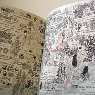
A 'doodle' is defined as an unfocused, aimless scribble or drawing, whilst a persons attention is distracted. Gerners' 2003 book entitled Branchages is a perfect example of mindless drawing, the book was entirely produced whilst Gerner was on the phone.

It has become a sort of personal journal. It witnesses my conversations, my readings and my personal reality.

        Jochen Gerner

 Branchages (Source)


Branchages gives an insight into his thoughts, feelings and conversations through clues in his work, it is through Gerners subconscious that these are portrayed to each page. When looking at pages from Branchages, your eyes don't know where to look, there are so many tiny little moments Gerner has unknowingly shared with us.


Tuesday, November 16, 2010

ILLUSTRATIONS THAT DEFINE A DECADE: NOMA BAR

"The simplicity of a logotype with meaning and emotion"

Noma Bar, an Israeli born graphic designer was also featured in the Summer 2009 issue of Varoom. Unlike Hardstaff he works in a very different field whilst also provoking the same reaction, their work is both well-thought and has much more meaning than just 'meets the eye'.

(Source)
Noma's style and influence originated from a simple radioactivity symbol on a black background, we've all seen it and probably didn't think too much of it, but in this Noma saw two eyebrows and a moustache and in his mind this was the face of Sadam Hussein. He developed this signature style during his move to London working for several publications.

It is through his strategic placement of vector shapes and colour that Noma produces such politically questionable and cultural graphics, none of his work is as simple as it seems, there is alot of context behind it all.


(Source)

Noma's work is that it is reduced to the bare minimum. Sometimes you can't beleive how little he needs to make an image. 
Mark Porter
An expert at "saying a lot with a little", Noma's unique style makes you think, and it is through his deeply-thought illustrations on political, religious and social perception that his works combined are a perfect example of Illustrations that define a decade.

ILLUSTRATIONS THAT DEFINE A DECADE: JOHNNY HARDSTAFF

"A decade fragmented, networked and connected yet coolly detached"

An article featured in the Summer 2009 issue of Varoom Magazine recently caught my eye, it has several articles discussing just what is the definitive illustration of the last 10 years. The wide variety of illustrations provide a thought-provoking view on contemporary society.

Johnny Hardstaff is both a graphic designer and animator whilst also as working in film and video. He first came into the limelight in 2000 at a festival in Prague with his work entitled 'History of Gaming', commissioned by Sony PlayStation. The nostalgic animation begins as a gem, then unfolding into a sidescrolling animation detailing a timeline of graphic references to growing up in the 70's.

Source: Varoom 2009 Summer issue (scan)


Hardstaff works meticulously in developing models and plans with finely detailed models and plans with finely detailed and intricate drawings.

Shane R. J. Walter; original article


As a follow up to his History of Gaming, Hardstaff was further commissioned to produce another short titled Future of Gaming, also for Sony PlayStation. The short opens your mind to both story telling and emotion within animation. Hardstaff has shown it is possible to make memorable work that has substance, meaning and 'intelligent playfulness'.  

The work of Hardstaff has deep meaning behind it and is well-thought, not only does it have impressive graphical cues mixed in with a blizzard of cultural and historical references but it doesn't shy from having a narrative. Hardstaff tells a highly visual story with his work, making his pieces a perfect candidate for defining a decade.

Monday, November 15, 2010

TRIANGULATION BLOG

Screenshot (Source)

Triangulation Blog is one of the most subject-varying blogs I'm following, ranging from architecture to animation to 3D modelling it provides an insight to all things design. Initially following for the interesting posts on contemporary and concept architecture I found that all other categories are equally as impressive.

Black on white, the design is beautifully simplistic and easy to navigate, I enjoy every post that's made. With most of the content being digital it really inspires me seeing some visual outcomes of just what software can produce.

ART INCONNU

Screenshot (Source)


Perfectly described as a collection of "works by artists who are forgotten, under appreciated or little known" Art Inconnu is a great source of information on those less famous artists.

I first came across Art Inconnu when researching Eric Ravilious, after searching the internet to no avail, Art Inconnu was my last hope for information. Although the design and content of Art Inconnu are much more traditional I can't help but enjoy the artists work that is posted. It's always nice to go back to basics and see some old-fashioned painting, sculpting and pastels.

THINGS ORGANISED NEATLY

Screenshot (Source)
Things Organised Neatly is a blog entirely dedicated to those pedants amongst us. More of a shrine to perfection, its main focus in content is, as the title suggests, things organised neatly.

When browsing,  you can't help but realise how pleasant it actually is to see things efficiently sorted in order of colour, size or shape. The simplicity of arranging objects out in mostly linear paterns really makes for some interesting photography that wouldn't look out of place in exhibition.

Reguarly updated, the simplicity of the blog itself makes for easy-browsing and the design keeps things simple, complementing the photography.

DESIGN DUST

Screenshot (Source)

Design Dust; 'a collection of photography, graphic design, fashion, architecture and other creative matter. '

Design Dust is a very simplistic blog focusing more on visual than the written content, it links to several other subject-related blogs. Containing innovative creative content such as pop-up books and simplistic, vector artwork the posts really are inspiring.

THE ARCHITECTURE BLOG


Screenshot (Source)

The Architecture Blog showcases some of the greatest man-made structures, focusing mostly on home designs, contemporary interior design and concept house exterior. The posts really are inspiring, I follow The Architecture Blog simply because it exhibits some of the finest architecture around. I have always been interested in home-design making this blog ideal for me.

Posts are made regularly on world-wide designs, less of an original content blog The  Architecture blog focuses more on exhibiting other bloggers work as a hub for information.

Wednesday, November 10, 2010

FESTIVAL OF BRITAIN: 1951

The Festival of Britain took place in 1951, opened by King George, it celebrated the nations recovery after the Second World War. It was a showcase of the best science, technology and design aimed to inspire the redevelopment of an already ruined London. The festival was an attempt to give a feeling of recovery and progress and to promote better-quality design in the rebuilding of British towns and cities following the war.

Skylon (Source)
Several graphic and architechtural designers were recruited to aid the design and construction of various buildings. Abram Games was the graphic designer for the event, as an official war poster artist at the time he heavily influenced people to visit the festival with his series of posters and flyers.

The Skylon a large, unusual shaped tower described as a "vertical feature", was one of the most notable structures of the festival.  Aimed as less of an art statement and more futuristic thinking, the tower is supported through tensegrity using three cables to support it, coated in alliminum and lit at night, the Skylon was the most thought-provoking piece at the festival.

HENRI GAUDIER

Bird Swallowing Fish, the 1914 bronze cast sculpture by French sculpt Henri Gaudier caught my attention at The Restless Times exhibition in Sheffield.

Bird Swallowing Fish (Source)
Gaudier worked in a very primitive style, often taking influence from nature and animals in his work. Having no formal qualifications or experience he moved to London to become an artist, inspirted by his carpenter father he began creating minituristic sculptures. Often creating sculptures by direct carving into solid, opposed to working with the wet plaster, Gaudier creates eye-catching naturalistic works with then go on to be cast in bronze.

ERIC RAVILIOUS

The Westbury Horse
Eric Ravilious was an English painter and designer. He
began his artistic life as a muralist and worked from 1924 until this death in 1942. Ravilious was an comissioned as an official war artist during the second world war where he died during service.

Ravilious often painted water-colour landscapes, focusing on the relationship between the modern world and the English landscape, in a style that was both formal and yet deeply felt.


Train Landscape


Train Landscape and The Westbury Horse are two great examples of Ravilious water-colour paintings.

Tuesday, November 09, 2010

RESTLESS TIMES

Restless Times; Art in Britain 1914 - 1945

A recent visit to the Restless Times exhibition in Sheffield broadened my awareness of pre and post war artwork. The works in the gallery range from sketches to paintings to sculptures and prove that the first half of the twentieth century were some of the most destructive yet creative decades.

A few pieces that caught my eye were by Eric Ravilious, his series of oil-painted canvas entitled Train Landscape, Chalk Paths and The Westbury Horse. A sculpture by Henri Gaudier also caught my eye, Bird Swallowing A Fish (1913 - 1914) is a bronze sculpture widely influenced by Gaudiers' studies of primitive art.